
24. Philadelphia Eagles
Strengths: They are unique in that they are one of a handful
of team which do not have a logo (per se) on the helmet. I like the pearlized
green.
Weaknesses: I thought they would be higher on my list, but
the more I look at these, the more I think the wings just look awkward. They
begin at the forehead. I mean honestly, who has wings starting on a man’s
forehead? I don’t like the combination of the dark green with black and overall,
they just lack something that is needed to be in the top half of the league
when it comes to dome protectors. Ideas for Improvement: I think these would benefit from either a white or a chrome facemask (I would go chrome). From there, a tweaking of the log could be in order.

23. Saint Louis Rams
Strengths: I like the unique helmets like the Rams where the
mascot is the inspiration for the helmet design rather than an actual logo.
With that being said, the Rams helmet is ok, but nothing special.
Weaknesses: Just like the strengths, I don’t see any glaring
weaknesses. The biggest weakness is the lack of strengths and the fact that it
just feels like it is missing something.
Ideas for Improvement: This is a solid helmet and I have a
tough time putting my finger on what could be improved. I would like to see a
pearlized blue paint and see what a gold facemask could do.

22. San Diego Chargers
Strengths: I love the bolt and these are much better than
their old blue helmets.
Weaknesses: The dark blue facemask.
Ideas for Improvement: This is a solid helmet that could be,
and should be, better. I don’t dig the dark blue facemask. These would look
really good with a white facemask. The other option, and the one I would love
to see, is to give these the powder blue facemask.

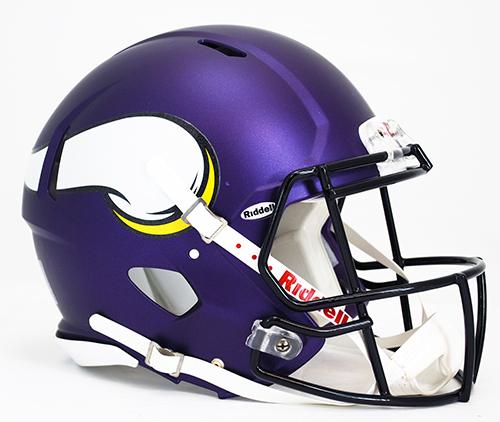
21. Minnesota Vikings
Strengths: I like the improved Viking horn and the new
pearlized purple color.
Weaknesses: The black facemask.
Ideas for Improvement: Why put a black facemask on a
dark(non-black) helmet? Black isn’t even one of their colors. This helmet would
be much better with a purple facemask (just like it used to be). If they wanted
to make a statement with their new jerseys, I think a yellow facemask would
look good. 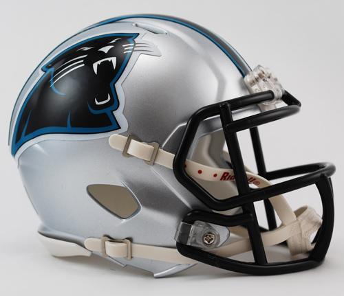
20. Carolina Panthers
Strengths: Overall a solid helmet. I like the silver helmet
with the black facemask.
Weaknesses: The logo. It is not a terrible logo, but it
could use some improved lines and definition like the Lions did with their logo
a few years back.
Ideas for Improvement: I would definitely upgrade the logo.
If they wanted to go beyond the logo, while I like the black facemask, I would
like to see these helmets with the Carolina blue facemask. 
19. Detroit Lions
Strengths: The upgraded lion logo was a good decision.
Weaknesses: Incorporating black into their uniforms
(especially on the facemask) was a terrible decision.
Ideas for Improvement: This helmet should be higher if not
for the black. I will never understand the reasoning behind teams feeling the
need to get black into their uniforms. The Lions colors are blue, white, and
silver, they should keep it that way. Go back to the blue facemask and the blue
and white stripe. Get rid of the black.
18. Seattle Seahawks
Strengths: I like the flat paint and the kevlar looking
stripe. They went out on a limb with these helmets and I think they did a good
job.
Weaknesses: No bright green from the jerseys.
Ideas for Improvement: The Seahawks switched up their
jerseys and went with a really bright green, yet didn’t incorporate any of that
bold coloring into the helmet. I say go all out….rock a bright green facemask.
17. Pittsburgh Steelers
Strengths: Classic.
Weaknesses: A logo on just one side? I know it is unique,
but not all things that are unique are good. A one winged plane is unique, but
not good. I like symmetry and the one logo drives me crazy.
Ideas for Improvement: Flat black. What team could pull off
flat black like the Steelers could. Despite my hatred for the Steelers, if they
went flat black and two logos, even I would have to put them in the top 10
helmets. Check back on Friday for the bottom 8 of the top half.
No comments:
Post a Comment